
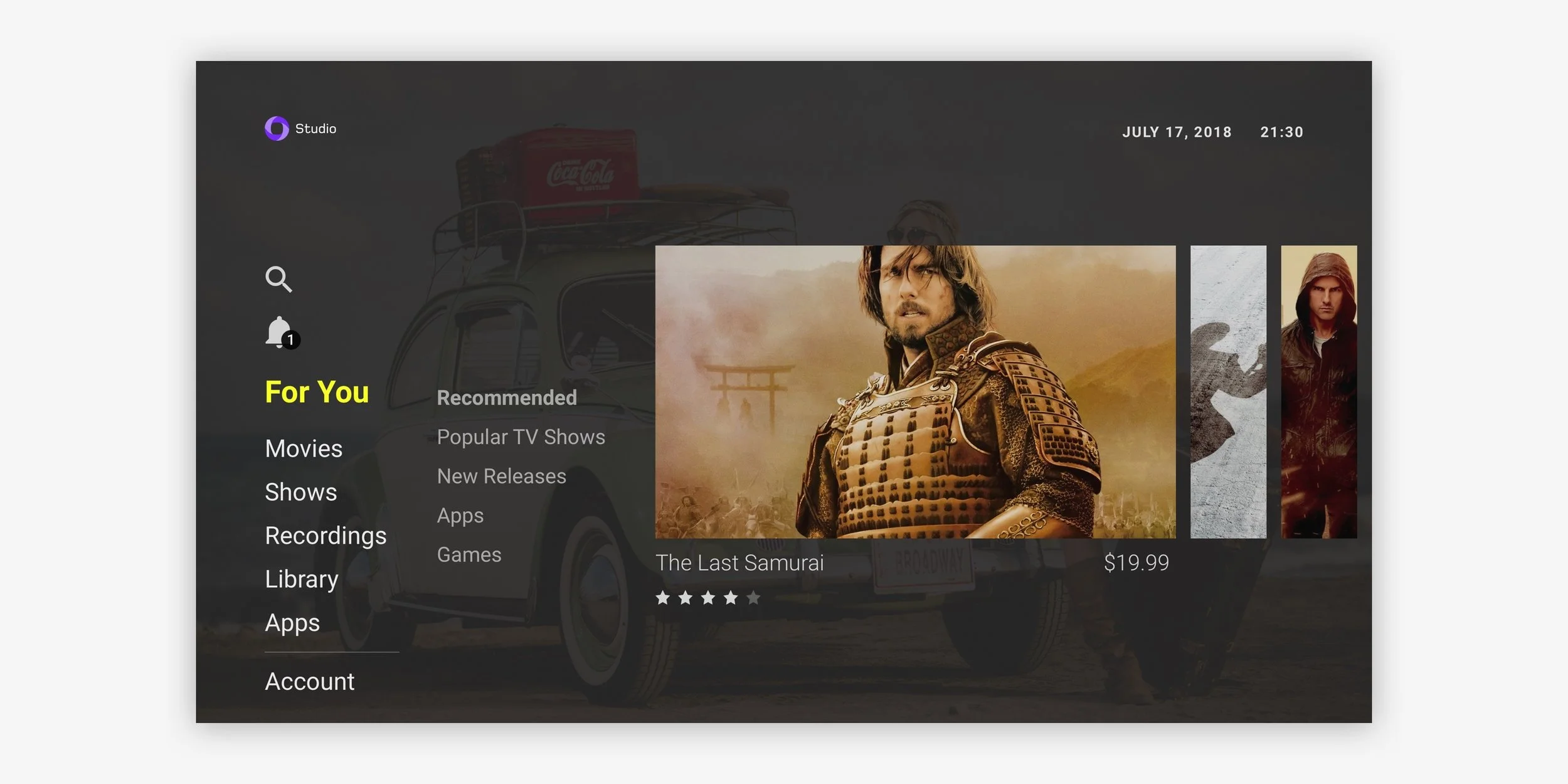
Ice-cream Pie: Movie Detail
Background
We were tasked with creating a new and “modern feeling” template for our set-top-box solution on Studio PayTV to provide clients options.
We began by looking at the current available Studio PayTV template: Bubblegum. We took into account on what it did well, what it didn’t, and what potential clients were looking for. From there, we undertook how we could create a template that was significantly different that provided clients with options and still deliver on the same functionality.
My Role
I was the project lead for this project. I worked with the PM, Dev, and one other Designer. I developed Wireframes and concepts to be presented at IBC.
Bubblegum - Miniguide
The Start
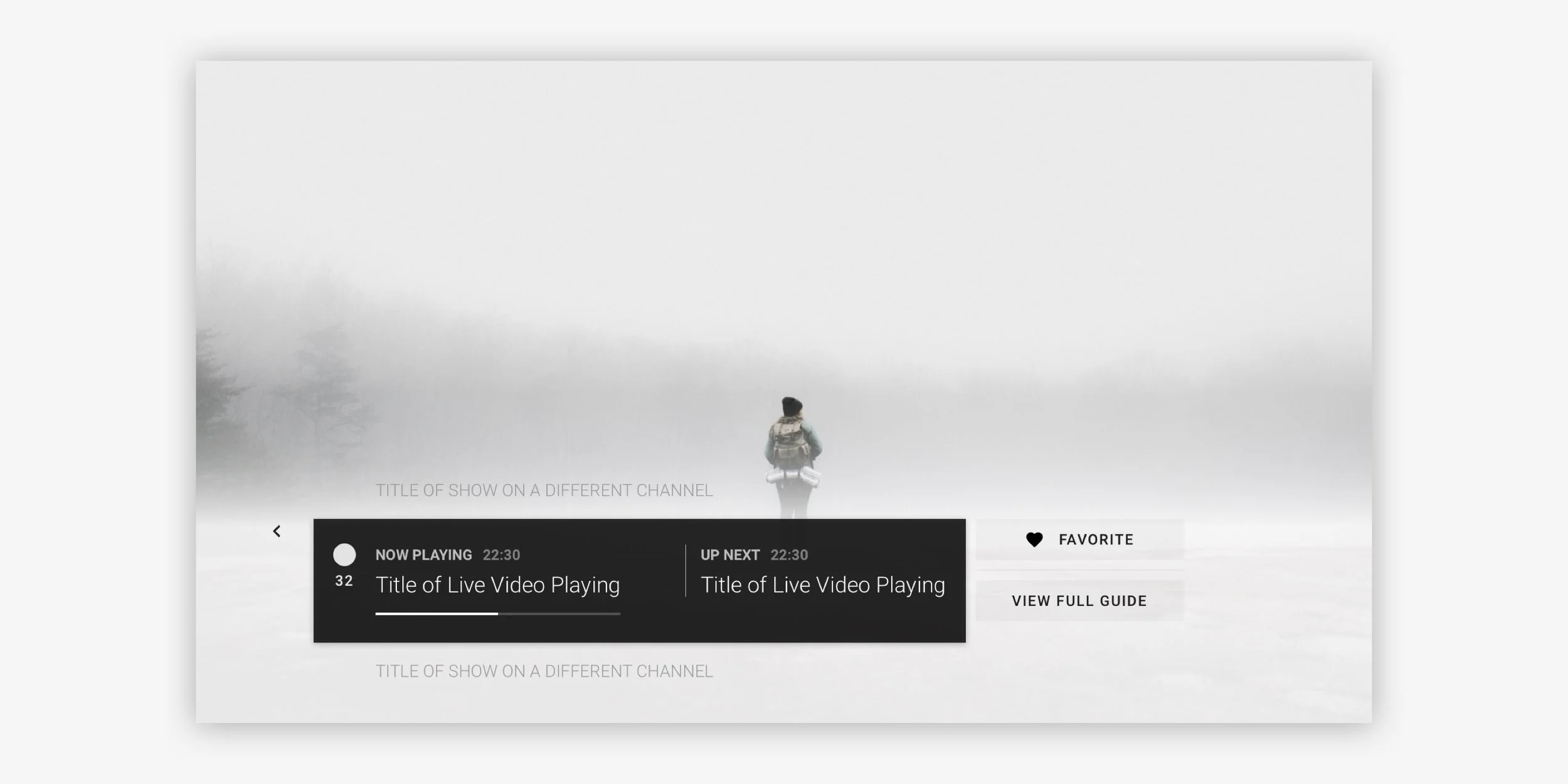
Upon our initial assessment, we came to realize that a lot of UI elements were taking up unnecessary space. For an example, the “Miniguide” which opens when a user is browsing through different channels during Live. The UI elements for the Miniguide cover a large majority of the screen. Sure, users are now focused onto the Miniguide because the user has clicked a directional button on the remote which signifies they are interested in the info, but the user is still watching the program; the user may want to channel surf while another is watching the program. This was one of the biggest feedback from clients. “Please shrink the Miniguide because we can’t see what’s playing on TV”.
Amongst the Miniguide, there were other things we wanted to do different than the Bubblegum template. We wanted something to look more “modern”, cleaner, focused more on images — the Bubblegum template was very text heavy — and different. This was quite challenging since one of the limitations were to “try to reuse as much as you can, but make it look new”.
Wireframes of the new Template: Ice-cream Pie
Ideation
Since the features are the same as the current template at the time: Bubblegum, we dove into designing different concepts and ideas on what users will see when they turn on the TV to how they will navigate to browse different content.
There were two areas we focused on
Browsing content
Live experience
Bubblegum - Main menu
Traditional Design
The Bubblegum template followed a traditional templates with swimlanes on swimlanes mixed with grid views of content. Essentially, you’re looking at a digital bookcase. Although it’s great for browsing content as a whole, it becomes overloading which overwhelms the user in actually selecting something to watch. There’s always “Oh, that’s better to watch, wait… — scroll a bit — that is…” on repeat.

Ice-cream Pie swimlane wireframes
Making it a image content focused experience
We wanted to change that traditional outlook. We decided for the template to be more focused on the image with very little disruptions. We started by increasing the size of the swimlanes so it would take up a large portion of the screen size. Not only are we allowing the content images to carry experience, but the user is more focused into what they are looking for helping the find content faster.


The Theme
As we were doing these explorations in Wireframes, we often forget that, once a bit of theming has been placed, the experience could be different. Things we didn’t see, or ideas may spring up as we start to see it more polished.
The theme we decided to go on at this stage was something more minimal and on the lighter side as it contrasts to the busy dark Bubblegum theme.
In the concept, the user lands on the Live player which behaves like traditional TV. The user can then open a menu which is then overlaid on-top of the live player to browse apps, movies, and other VOD content — This differs from the Miniguide. As the user is browsing the main menu, the Live player still plays in the back so the user can still listen on what’s happening while they are browsing.
Transition from Live player to main menu
Live player to menu
Above shows the transition between the live player to the menu


Separating the Swimlanes into menu items
After some review, we felt that the current swimlanes on the Bubblegum template could be used as sub-menu items. We are really creating a focused experience now since each swimlane is now independent from each other.


New type of swimlane
As we wanted to offer different ways of presenting information to the user, we decided to explore different methods on what we can do to the traditional swimlane look.
We came up with this concept where it’s a narrow bar that indicated enough info, but not too much on what’s coming up next. This fits in our design paradigm of focus onto the item you are currently looking at. We liked the way it turned out.
The Live Player
The live player is where wanted to make sure we got right since most users will be watching TV. For this template, we wanted to offer a contrasting experience where it would be minimal. As mentioned earlier, the Bubblegum template’s miniguide covers the majority of the screen. We wanted to go towards a different direction.


Exploring different ideas
We explored different ideas on how to design the Miniguide for the live player. The challenge was how do we create something where it does not take up a lot of space, but provides enough queues and information for the user?
We started playing around with the design and organizing information that is useful to the user. We removed the full description as the user can read more via info button on the remote; we brought less emphasis on coming up next as we wanted the user to go to the guide to see a full version to help them plan out what to watch; we created a category section which organizes the channels into favourites or theme so that users can find what they want to watch faster; etc.


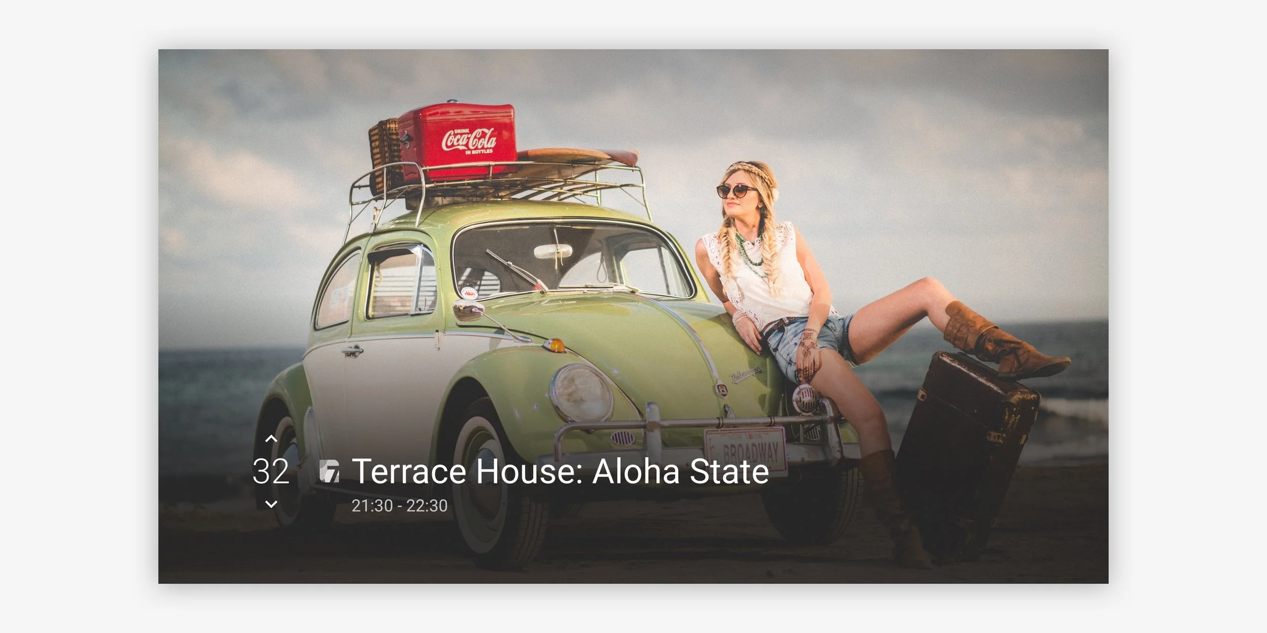
Higher Fidelity
Creating higher fidelity wires made us see more, and organize items better.

Exploration on a lighter theme
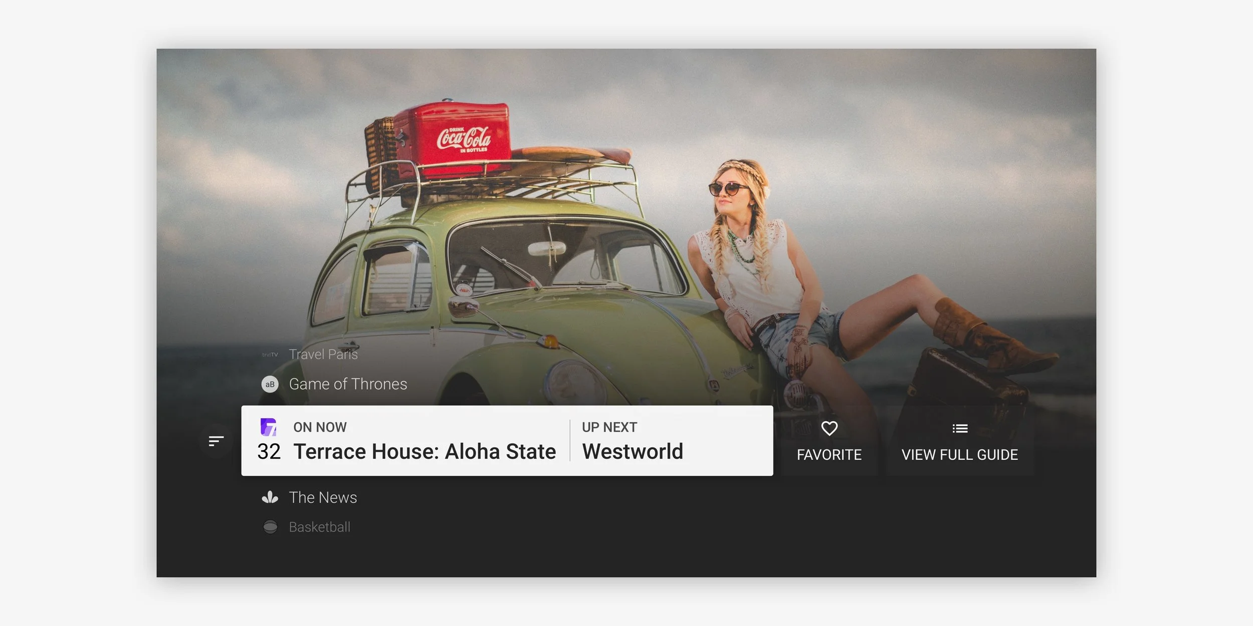
The Inconvenient Truth
As we were working away, getting input from the product manager, devs, sales, and other designers, things were going good. We figured out a layout we want to proceed with, we have a theme which offers something completely different from the other template: Bubblegum. However, this theme of using lighter colors on 10ft experiences is very reliant on content images. We tried putting real images that our clients would put, and it just didn’t look good. The white overlays didn’t always work.
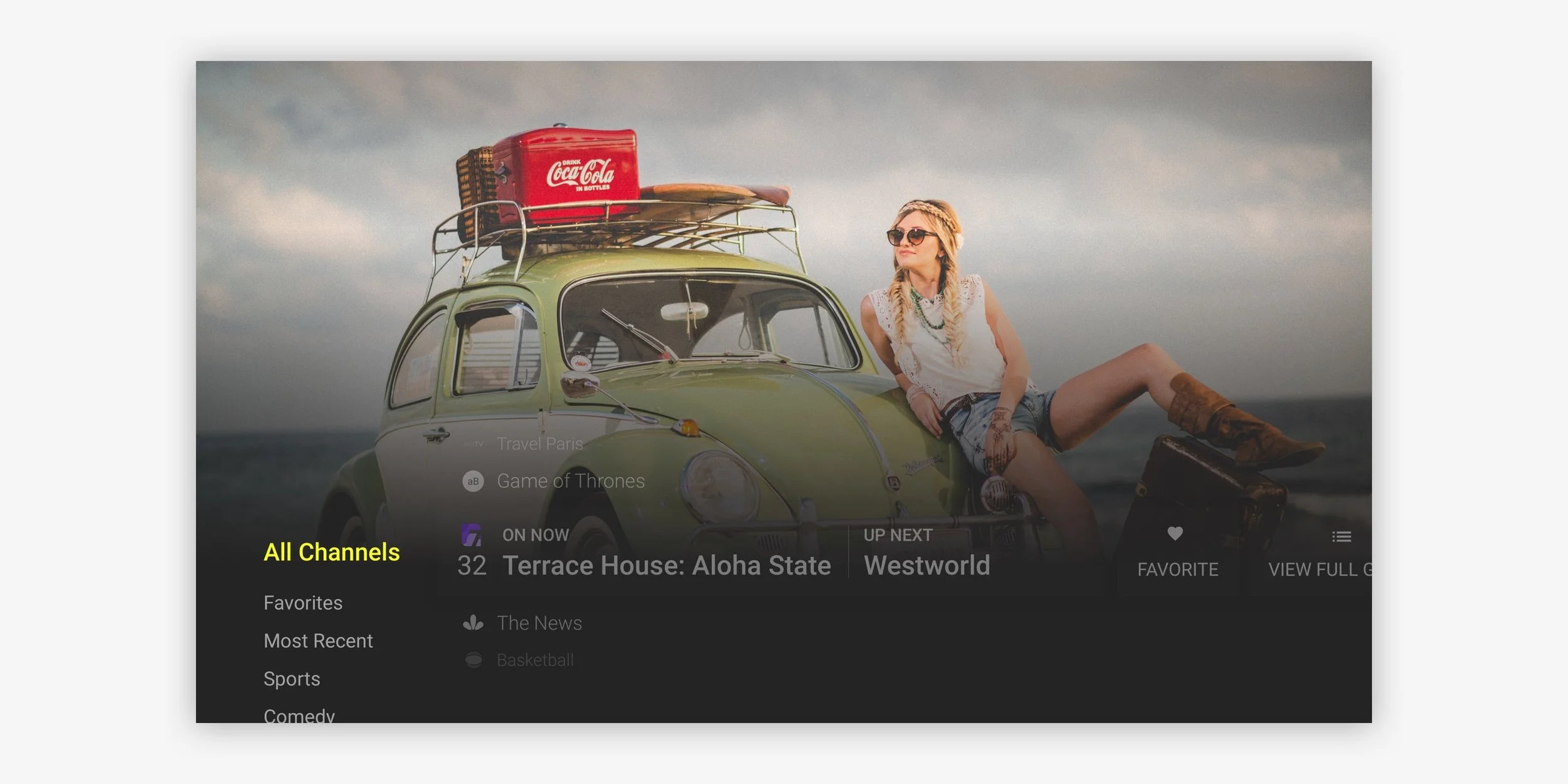
We had to pivot and use a darker theme which was more adaptable to any content clients decide to use.
Live Experience
Main menu


Movie / show detail


