
The Problem
The property editor is a key tool users interact with when creating an app using Accedo ONE: Studio Professional. Due to its complexity, flexibility, and abundance of features, the property editor can become troublesome to navigate and find settings.
My Role
My Role for this project was to reorganize the abundance of properties, and the redesign of the property editor. I was in charge of the IA, user research, testing. I was then to present my findings to the development team and the product manager to get their buy in.
Challenges
The challenges for this project was more in getting the development team and product manager to buy in on the redesign. Due to legacy code, it would be a large investment in restructuring this feature.
The users
When we first started this project, we knew there were frustrations, but we wanted to know exactly where, and how the user felt about the current feature. We went out to the user and spoke to the user directly to get their direct feedback. We spoke to users that would fit into 2 personas: Antonio (The Product Integration Engineer), and Xavier (The Project Manager).


The frustrations
After speaking with the users, we found out their frustrations lie within finding information and navigating within the property editor -- it required a lot of clicks back and forth. To further extent, the property editor can get very deep -- there can be many layers-- and in order to get back out, the user would have to click the property editor’s “back” arrow several times. Furthermore, we found that the properties are all scattered. The properties were not in any logical groupings which made it hard for the user to find things.
The process
After obtaining all the information regarding the user experience of the property editor, we looked at the “App Composer” as a whole. We asked ourselves, “what can we do to improve ease of finding the right property to edit with the least amount of clicks?”
We looked at similar WYSIWYG products and analyzed if they had the same problems, and / or if they solved them. We compared it to our own and hashed out what we did like and what we didn’t.
We brainstormed what we could do to fix the issue at hand. We came up with 3 methods.
- Organize the properties
- Redesign how the property editor is laid out
- Create a tree view where all the components and layers are listed. The user can jump to the specific component / layer directly.
We started sketching out some ideas on how we could lay out the information. We started our first conceptual design based on a slight improvement of the current property editor. We added a simple tree view for listing out components and its settings. This allowed the user to navigate through different parts of components and other components easily.
First Concept
Note: Videa is pre-merger product before it became Accedo ONE: Studio Professional
This concept however, although it did improve navigating the property editor easier, still presented the same issue. The property editor still required the user to click into settings -- they were pages where the user is just presented with a navigation item as seen from above.
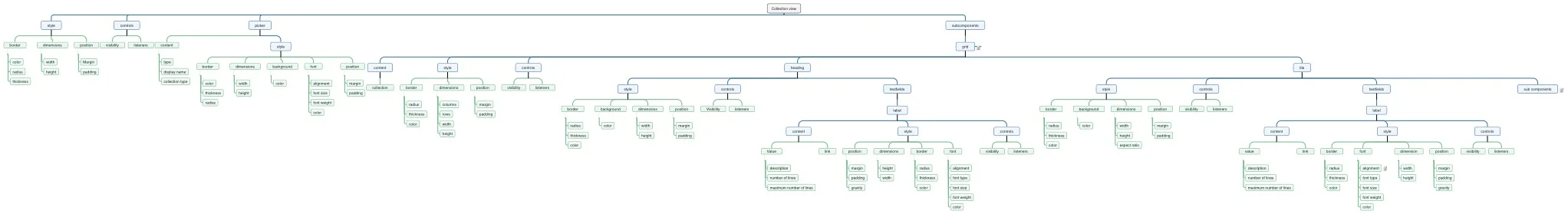
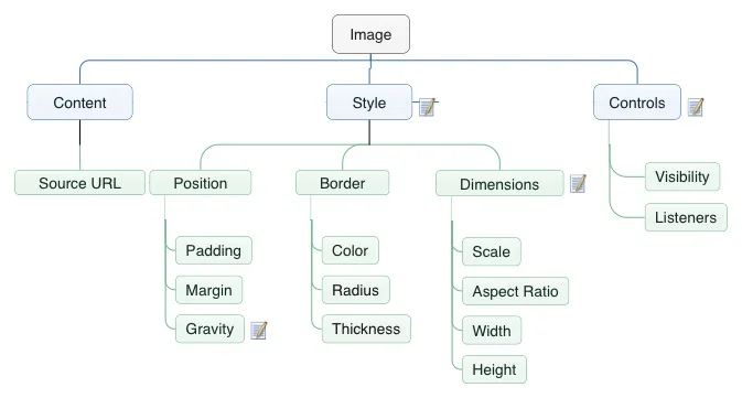
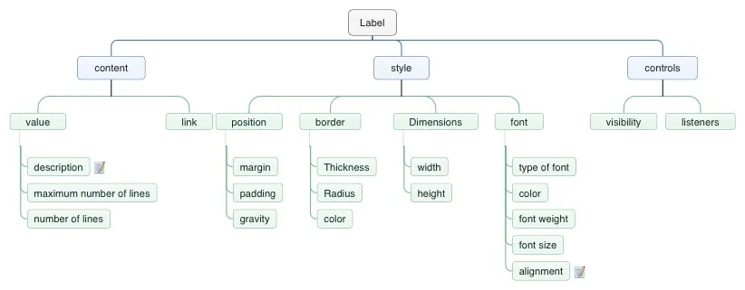
We realized we can put the properties into 3 categories: Content, Style, and Control.
Content: This relates to anything that deals with anything that generates something visible on the screen. It could be text or a feed.
Style: This relates to anything that deals with changing how a component looks.
Control: This relates to any logic that can be placed on an object. E.G. Navigate to when tapped on.
Generic Component IA
Smaller Component IA
Second Concept
Note: Videa is pre-merger product before it became Accedo ONE: Studio Professional
The second concept has where all the settings have 3 sub categories: Content, Style, and Control. From the card sorting exercise we did, we were able to organize that every part of a component can fit within the three categories. This will give the user a consistent experience. Every part of the component they want to edit will have the exact same categories and would expect to find the same properties within them. The user will no longer have to navigate out of a section of the component to edit something. All related settings are there and easy to navigate through.
With the second concept, there were still a heavy load of properties within the three categories. We realized that to help the user find things faster, we could further group related items within Content, Style, and Controls. The team came up with the initial grouping and group headings. We then took this to a hybrid card sort -- we wanted to give the flexibility for the user to create a new group if they feel that nothing belonged in the group headings we've created.


With this information, we put together a more refined component IA.
Refined Component IA
Third Concept
Note: Videa is pre-merger product before it became Accedo ONE: Studio Professional
The sub categories makes it even easier for users to find what they are looking for. We added in chevrons so that the user is not overwhelmed and has to constantly scroll to find the right property to edit. In addition, we added a breadcrumb trail to help the user navigate back even without the user of the tree view on the left.
Chevrons Opened

Note: Videa is pre-merger product before it became Accedo ONE: Studio Professional
After establishing the designs for the property editor, we went to focus on improving the tree view. We established that the tree view will display: Screens, Components, and Component Parts. With the combination of both of these improvements, we felt that it would greatly improve the user experience of the App Composer.
Improved tree view
With hover states
The buy in
After designing and testing with users on the effectiveness of these new designs, it was time to present it to the product development team. Due to the significant necessary changes of these improvements, it would require a large engineering effort. After presenting to the entire development team and the product manager, we had complete buy in. The engineers were in awe of the improvements and see the value of such improvements.
Final Results
Both users and the product team were won over by these designs. Both groups saw the huge improvement to the user experience as it increased efficiency and decreased the amount of constant clicking back and forth.