About Wirk'n
Wirk'n is an app that allows users to search and apply for jobs using their location with a modern twist. The app has a unique feature that allows its users to apply to jobs via video.
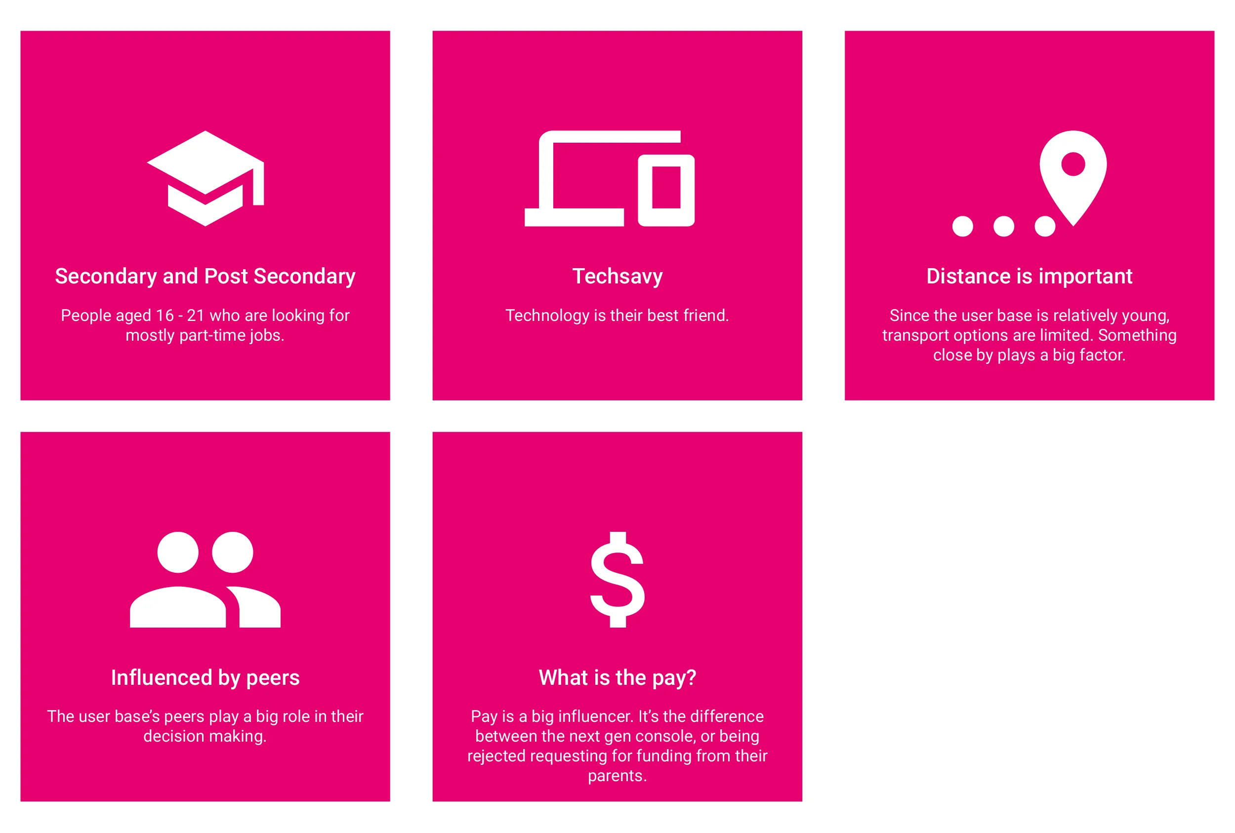
The app's user base is mostly comprised of a younger crowd - mostly secondary and post secondary students looking for jobs.
Challenge
Design the search function, search results, and job description pages for the Wirk'n app.
The approach
Due to the limited time, brief research was conducted. It was clear that the user base comprised of mostly secondary and post-secondary students looking for jobs – mainly in the retail sector.
With that in mind, I went to find out what and how the users go about in searching for jobs. I’ve also looked at established known job boards where the users frequent to search for jobs such as monster.ca. I then compared, it to Wirk’n’s current experience and flow.
After preliminary research, it was time to ideate. During the ideate phase, I took upon myself to not only think about the users, but the available manpower available to implement the design solution. I asked myself about business requirements, and implementation time with questions like: “How can we generate money?”, and “What can we salvage from current app design to save development time?”.
The Research
The Findings on the user
Designing the search
When designing the search, I looked into what other known job boards are doing, and what Wirk’n was currently doing. The current Wirk’n search function was an open input field with no filter parameters. This gave a blank canvas for me to work on. I then looked for others for inspiration, and to identify their pain points.
Well-known job boards such as monster.ca, filtering options are too detailed for what Wirk’n’s users need and require which result in “noise” for the user -- Monster and other large job boards are designed to be used by everyone. Since Wirk’n’s user base is secondary and post-secondary students, it was logical for me to cut and focus on parameters that matter most to the user to eliminate “noise”.
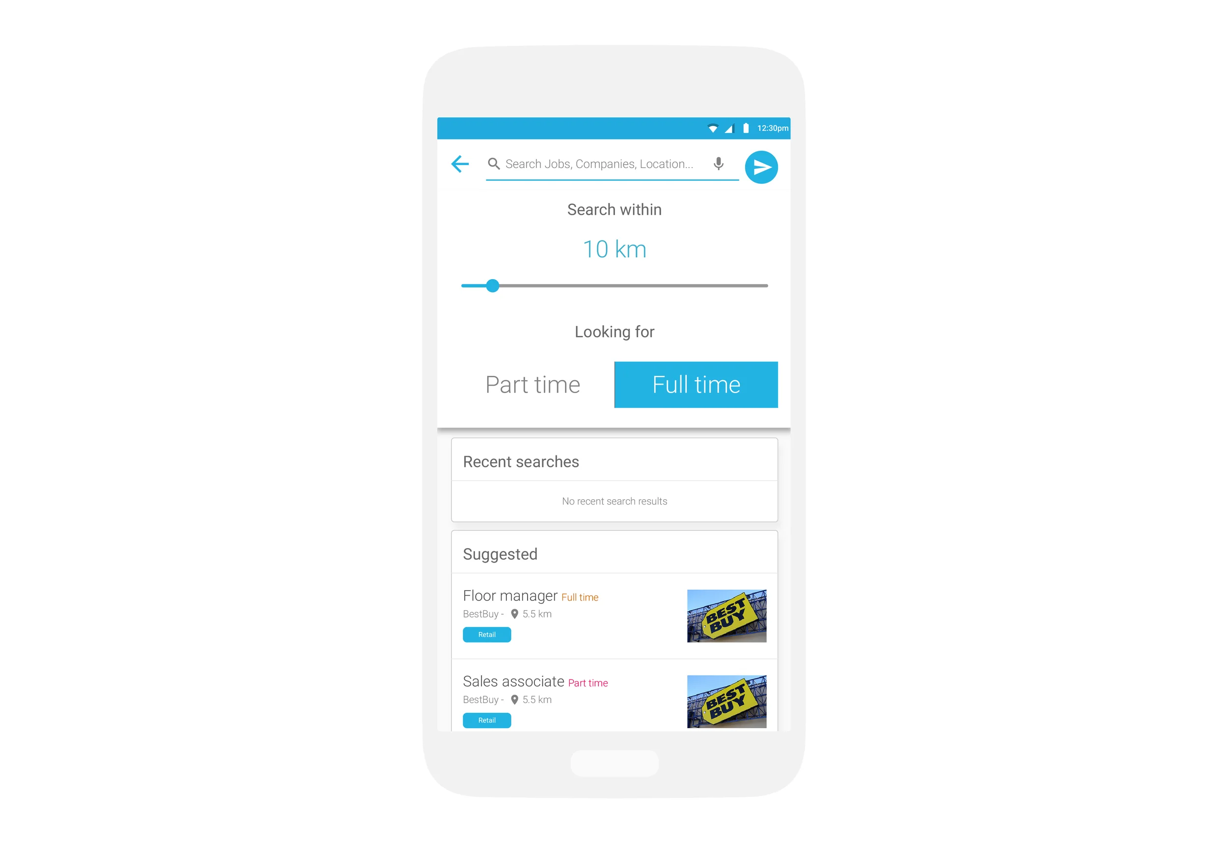
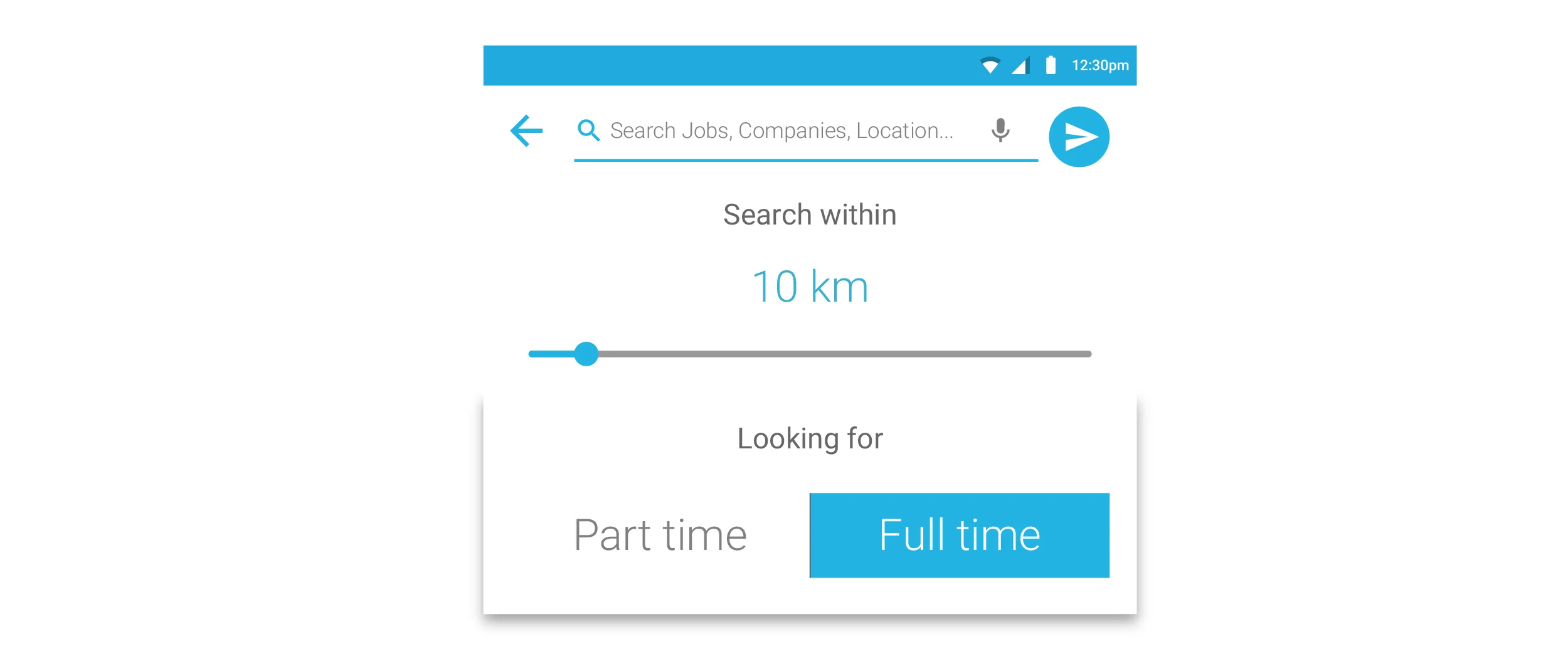
After careful planning and thinking, I’ve narrowed it down to 2 necessary filtering parameters for the user: Distance, and position type – whether if it’s part-time or full-time.
With preliminary research, I’ve identified that distance is a key factor in the user’s decision. Since the app works by using the user’s location, it was logical and efficient for the user to have a proximity as a filtering option to streamline their search.
The second filtering parameter is position type. The user either is searching for part-time positions or full-time.
The open input box covers any other parameters the user wants. I’ve identified this after researching Wirkn’s current search design as well as other job boards. The user already knows, and is used to typing in a specific manner that helps filter what they are looking for. However, to make it clear for the user, the input box will have placeholder text giving examples on what the user can search for.
With these 3 parameters, it would streamline the search much more effectively without having “noise”.
Search examples:
User goal: The user wants to search for a cashier position where the company does not matter.
<Input box> Cashier <Distance> 10 km <Position type> Part-time
User goal: The user wants to search for a cashier position at a specific company.
<Input box> Cashier at Aldo <Distance> 10 km <Position type> Part-time
User goal: The user wants to search for a cashier position within the retail industry.
<Input box> Cashier in retail <Distance> 10 km <Position type> Part-time
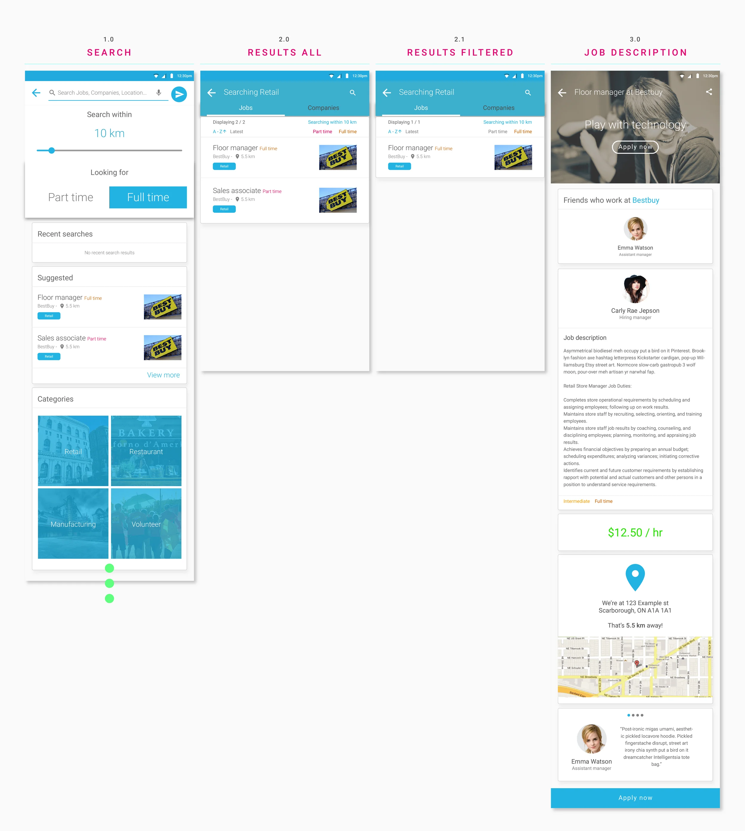
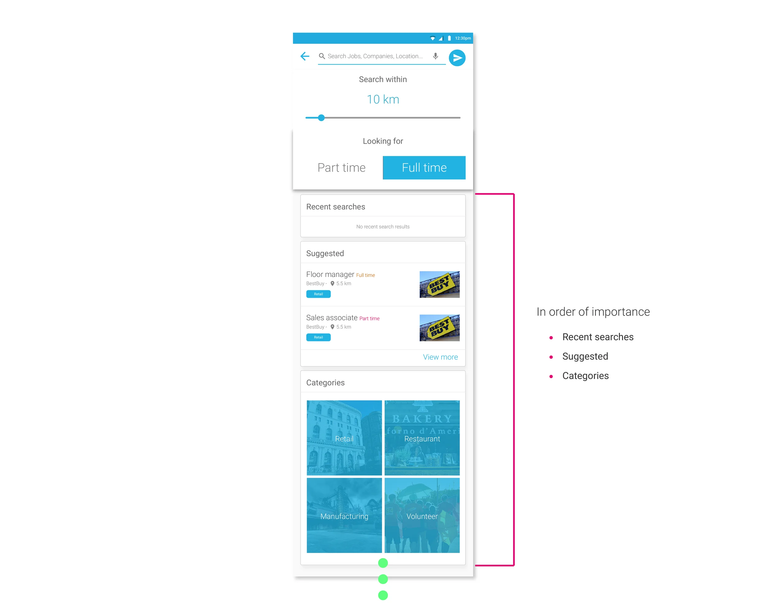
After the initial filters, I've added in cards that guide the user in their search.
The Recent searches is listed first right after the filters for ease of access for the user to save parameters they have set before for faster search instead of re-inputting each time. It makes it easier for the user who wants to check a specific company / job they want to follow.
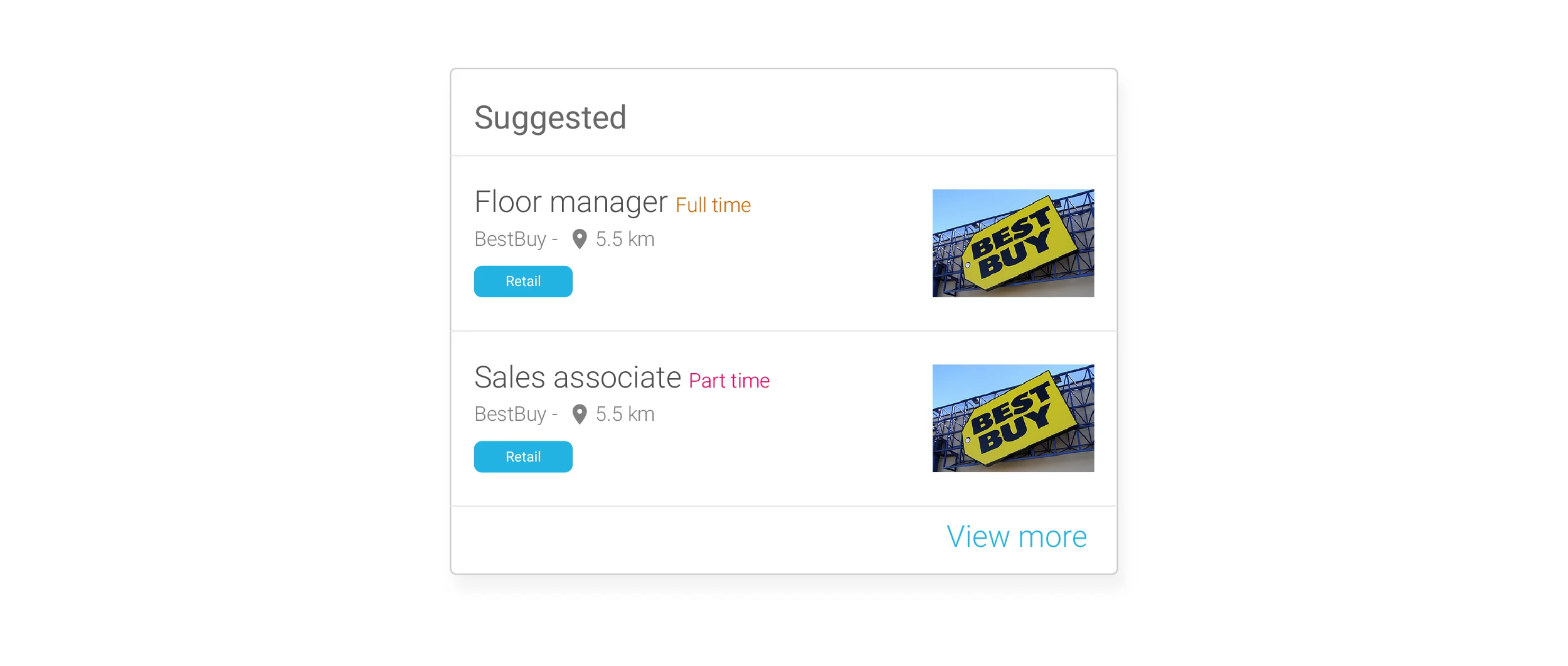
The suggested card under the search is to search for the user before the user even knows what they were searching for. It would be based on algorithms that track and is tailored to what the user has searched for previously. This card also opens doors for revenue generation from a B2B perspective in selling result slots for companies.
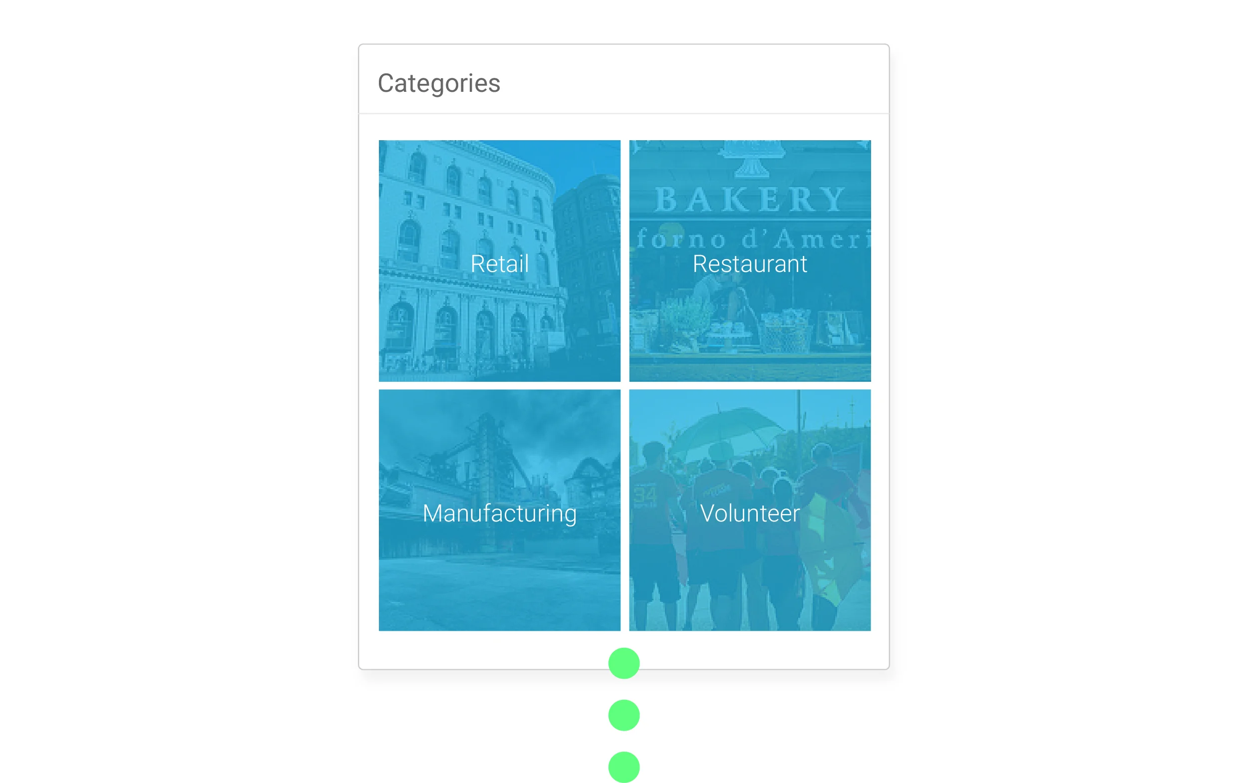
The categories section of the search interface is to help guide users on their search if they don’t know what specifically they are looking for, but have a rough general idea. It works similarly to Spotify’s “browse by category”. The user can further filter once the user has selected a category.
Designing the search results
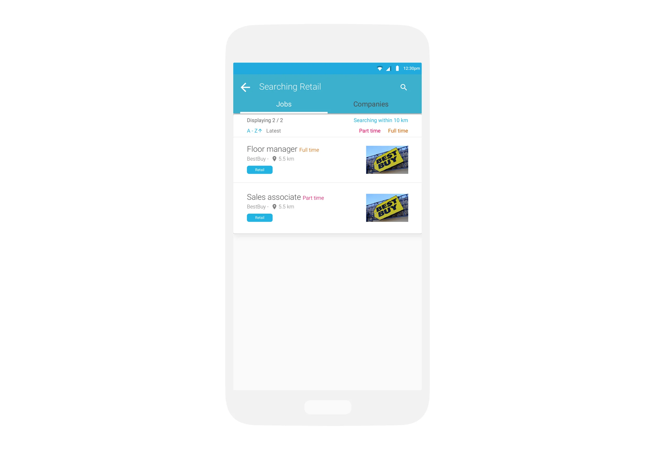
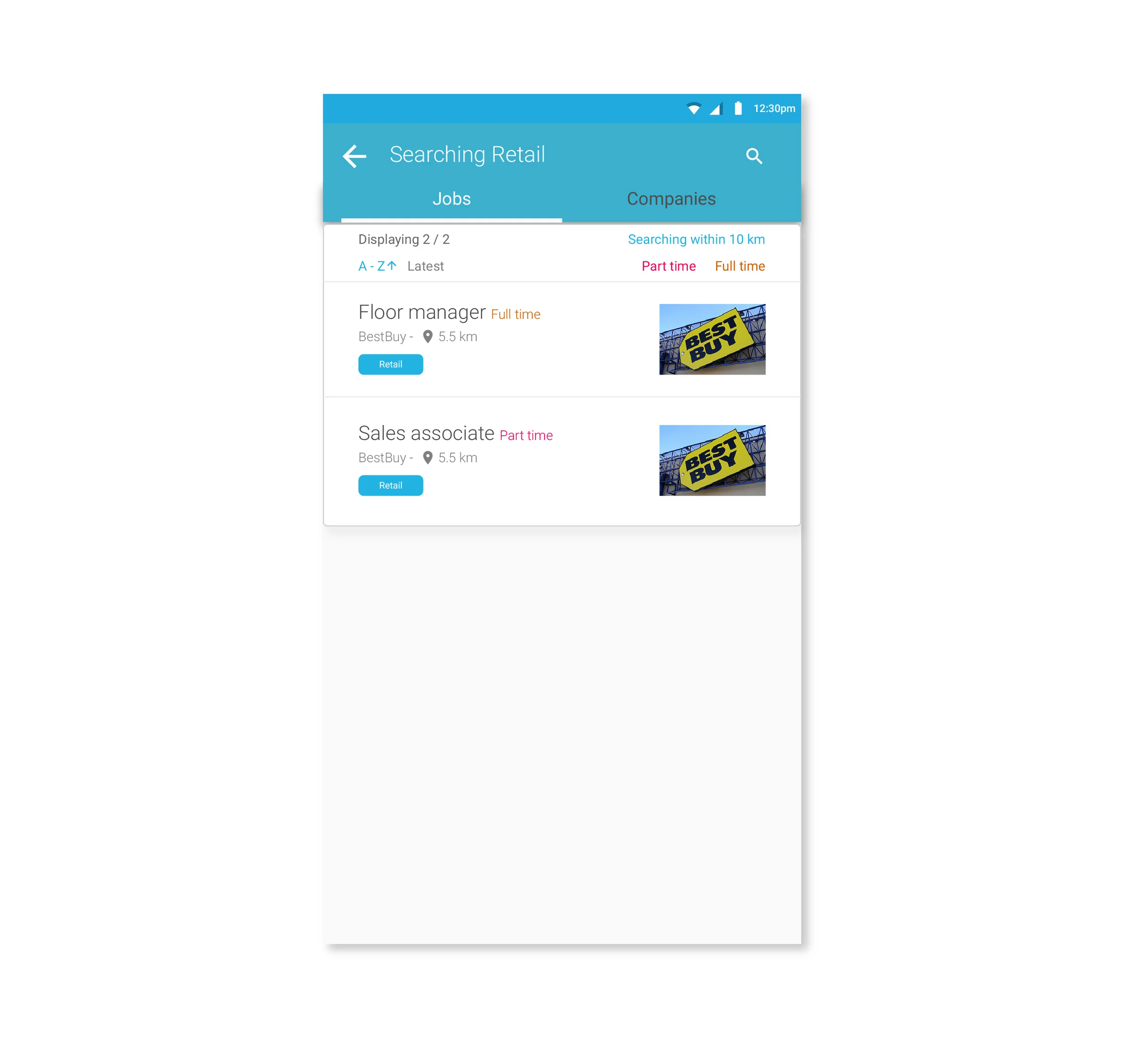
The search results page is landed on after the user has conducted a search. The search results page has 2 tabs: Jobs, and Companies. The “jobs” tab lists all open jobs depending on what parameters the user has inputted into their search previously. The “Companies” tab lists companies related to the search parameters the user has previously inputted. The “Companies” tab is a revenue generating product for the company which showcases the company in a more personable way as well as displaying their job listings.
To make the searching experience a positive experience, the product must be designed to reduce as much frustrations the user may have when interacting with the product. Once the user has conducted their search, the user should be able to not only see what they have searched, but change them without conducting their search again via the search screen.
The user may only want to change 1 or 2 things which can be changed on the fly, and help filter the results list.
Colour coding is used to help the user identify different position types (I.e. full time vs part time). The user can easily identify this through a quick glance if the user has decided to search for both.
Designing The Job description
When designing the job description, I had talks with the product owner and dev at Wirk’n. The product goal was to achieve a more personable description page for its user to build a deeper connection than just plain text read and apply. The challenge was to make it simple enough for the user to glance and digest the information quickly while providing required information from the company.
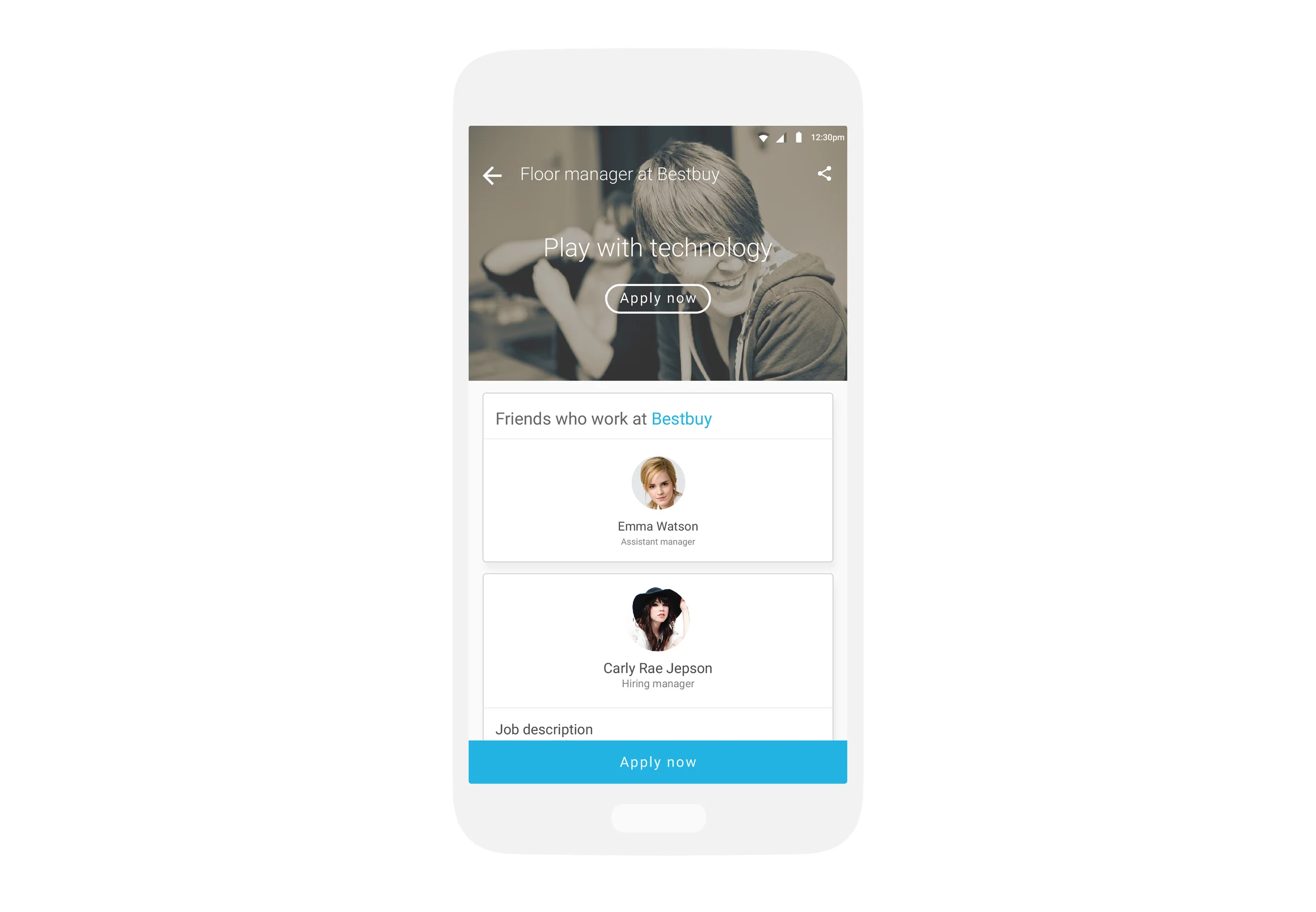
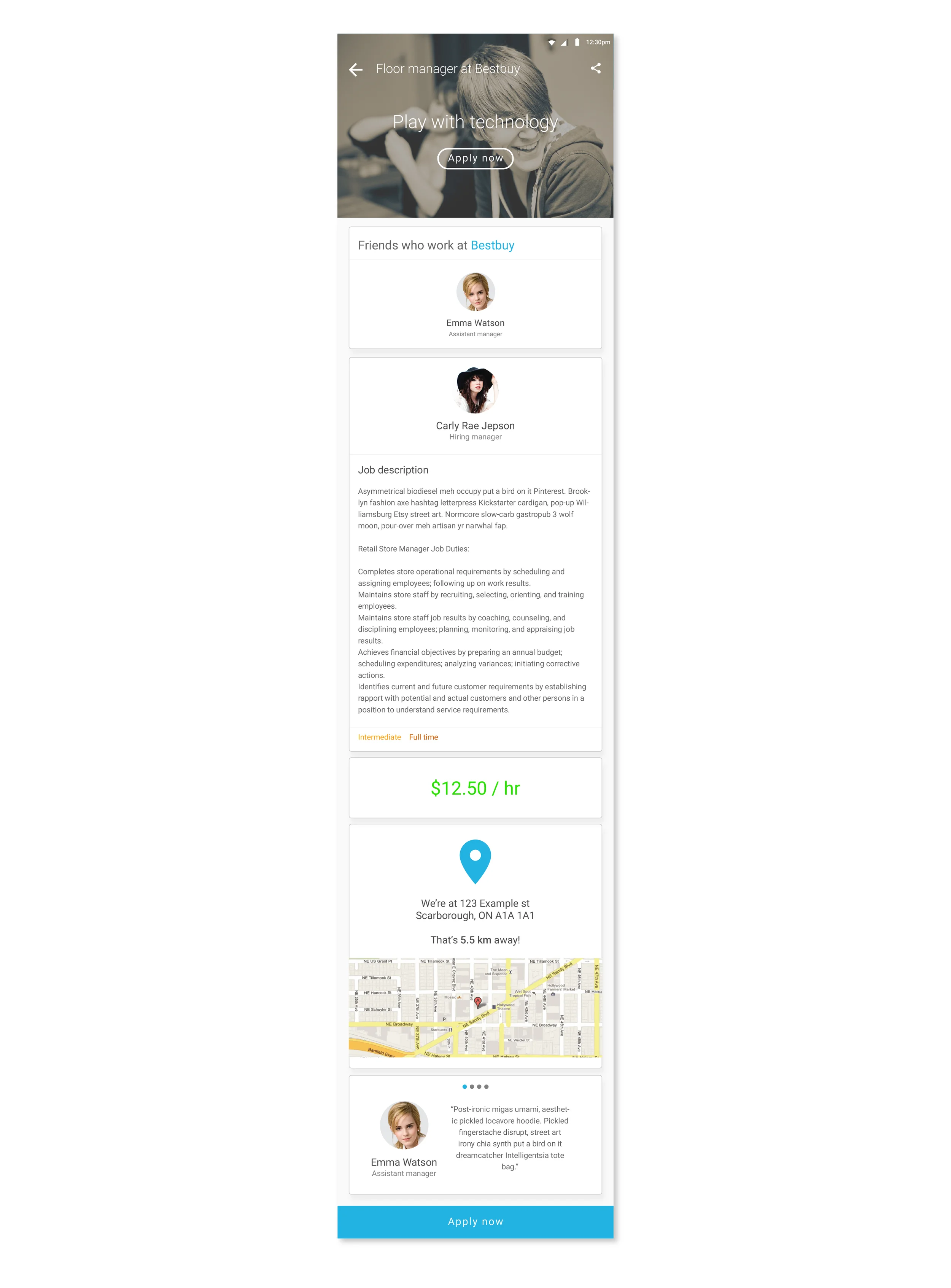
With the limited amount of time, I had to imagine myself in the shoes of the personas that would use the product. Job description, pay, location, and reviews were the first thing to come to mind when designing this page. I’ve later decided to make it personable to add in employer image, name, and title – it makes the experience more humanistic. A large image with a playful tagline in which the company can customize to match their branding was added to build a connection with the user as well as highlighting the main call-to-action which is to “Apply now”.
After this page was created, I took it to my interns to test and ask them questions on what they look for and categorize as important. I found through interacting with my interns that friend referrals, recommendations, and if they were working there plays a huge part of their decision making when applying for a job. Since the app connects with the user’s Facebook, it was no trouble for Wirk’n’s devs to add this feature in.
With that newly gained knowledge, I designed a more preferable experience and guidance for the user to apply. The flow goes as follows:
The user lands on the description page with a large image that supports brand culture, tagline, and call to action. The user then sees if any of their friends are currently working there; then job description. The pay is highlighted in green to make it feel positive, then the location is identified. For final reassurance to apply, reviews are then presented.

